Meaning and History
The well-known German company Wiesmann GmbH was founded in 1988 by brothers Martin Wiesmann and businessman Friedhelm Wiesmann in Dülmen, Germany. The brand specializes in the production of custom hand-built convertibles. For more than thirty years of its existence, the company has never changed the concept of its famous logo – a gecko.
1988 – today
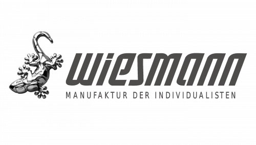
The original logo, accepted by the brothers in 1988, consists of two parts: an emblem and a wordmark on its right. The wordmark has a rich italicized typeface, which includes plenty of thick lines and sharp angles. The narrowed letters and the dark grey color make the inscription look more stylish and futuristic. The open contours of “E” and “A” add air to the lettering, as well as a thin line between the body and the dot of the “I”. Under the nameplate is located a tagline “Manufaktur Der Individualisten”.
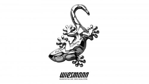
The famous emblem represents a silver-gray gecko. The image is very detailed, so we can see legs, tail, eyes, and even imitation of scales. The animal has an unusual form and that creates an illusion that he is alive and moving.
Emblem and Symbol
Geckos are known for their ability to crawl effortlessly on perfectly smooth surfaces. By choosing this animal as their symbol, the company wanted to demonstrate the abilities of Wiesmann cars to stick to the road at extremely high speed. In general, a gecko is a very remarkable symbol, that makes the brand unique and, at the same time, fully represents its philosophy.


