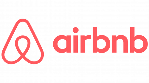
One of the most popular marketplace and hospitality services, Airbnb was founded in 2008. Today, it offers more than three million lodging listings.
Meaning and history
The Airbnb visual identity doesn’t have many versions created throughout the company’s history, as there has only been one redesign, in 2014, when the original blue logo, introduced in 2008 was switched to a completely new style.
2008 — 2014
The original logo for Airbnb was designed in 2008, but it was already the second version, as the company, started as Air Bed and Breakfast used another logotype, containing the whole name for a couple of years.
The first Airbnb version featured a white and blue cursive inscription, visually split into two parts, with the “Air” slightly overlapping the “BnB”. The wordmark in the lowercase looked friendly and welcoming, evoking a sense of security and reliability, and showing the company’s confidence and professionalism.
2014 — Today
The logo, created in 2014, might seem simple from the first sight but has many hidden meanings in its abstracts and lightweight emblem, placed on the left from the lowercase wordmark.
The emblem, resembling a rounded letter “A” has a drop-shape loop in the middle, which stands for the location pin symbol, and a person’s head, to show the process of choosing the accommodation. While the main “A” shape of the image also looks like the heart, turned upside-down, which represents the company’s attention to the customers and warmth.
2014 emblem
In 2014, the company launched a new brand identity developed by London-based DesignStudio and called Belong Together.
The Airbnb icon is a combination of four other icons, each with a meaning of its own (people, places, love, and Airbnb). Together, they form a shape that is both simple and unique.
Symbol controversy
Shortly after the launch of the 2014 logo, the company started to receive complaints stating that the emblem resembled genitalia. The company decided to commission a customer survey to make sure their logotype was appropriate. The survey, which was carried out by Survata, showed that the controversial likeness was noticed only by a minorityofconsumers.
Font and color
The Airbnb wordmark in the lowercase is executed in a traditional sans-serif typeface, which is very similar to JT Energy Bold and BR Candor Semi Bold fonts, with rounded shapes of the letters and elegant contours. The typeface makes the whole logo look serious and solid, evoking a sense of responsibility and loyalty.
The pink and white color palette of the Airbnb logo is a reflection of kindness and friendliness, it shows the company as a young and fun one, evoking a tender and caring feeling. This soft yet bright combination also makes the Airbnb logo stand out, as it is not very common, though looks sophisticated and stylish.


